An Introduction to iTunes Connect App Analytics
This article will give you a quick overview of iTunes Connect App Analytics, which is Apple’s new built in analytics tool. You will find this very helpful, if are new to app analytics and haven’t ever used this Tool by Apple. I will show you the most important features, as well as some super useful KPIs you can pull out of this system.
The Analytics feature has been released as a beta version in April of this year and the final version is online now online for a couple of weeks.
I think it is pretty cool, because you now have a decent analytics tool built right into iTunes Connect. Especially for beginners it is a great way to analyze your app and your KPIs, without the need to integrate any dedicated analytics SDK.
Start and Overview of App Analytics
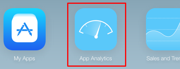 Start App Analytics from the iTunes Connect dashboard
To start it you log into your iTunes Connect account and select the second icon called “App Analytics”. In the next step you choose your app and then you will see the dashboard. It gives you a good overview of your most important metrics. These are:
- App Store Views
- App Units
- In-App Purchases
- Paying Users
- Sales
- Sessions
- Active Devices
- Crashes
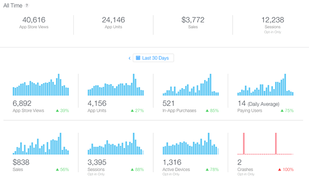 The Overview shows the most important metrics in one place
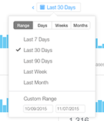
In the main part of this view you find these KPIs as individual charts, plotted over the selected time frame. You can change the range to one of the default values – e.g. the last 7, 30 and 90 days – or choose a custom range.
Territory and Platform Analytics
If you scroll further down, you will see a world map, which displays your KPIs separated by territory. This gives you great information, which countries generate the most revenue and are thus, the most valuable. You can switch the displayed KPI by clicking on the drop-down menu.
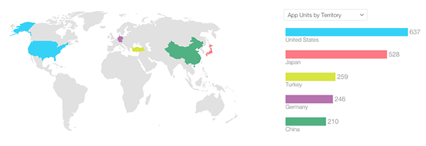 This graph displays the most profitable countries
On the bottom of the page you have the same KPIs broken down by platform. Once again you can select a KPI and you see a nice chart that breaks it down by platform. This helps you for example, to determine, if iPhone or iPad generates more downloads.
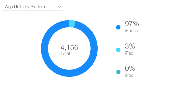 Get different metrics by platform
The last thing you find on the first page is a little chart about the app’s retention. If you are used to this kind of presentation, you will find this easy to read and useful to analyze user interaction. For those who are new to this: simply put, it shows you haw many users are returning to your app after X days. Naturally, more users come back after one day and less after a couple of days.
Detailed App Analytics in the Metrics Tab
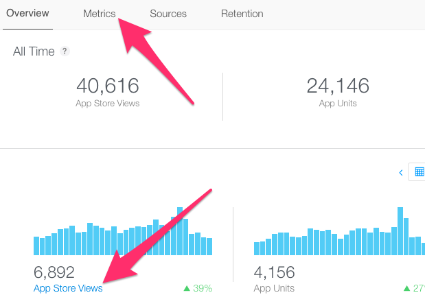
The overview is nice, but it gets really interesting, when you dive into the metrics tab. You can directly choose it or click on one of the charts to jump to a specific figure.
In this view you find interactive charts of all your metrics. All the KPIs listed above, are included and can be analyzed over time (you can again change the time range to your liking). It is possible to display a daily, weekly or monthly chart. This will allow you to look at the data in different granularity, e.g. to smooth daily noise in a big time interval.
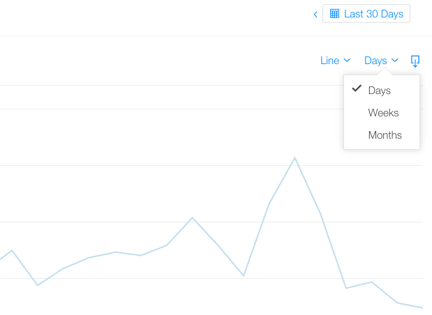 Change the chart to weeks or months to get the bigger picture
All the data is also displayed in a table below the charts, which allows you to look at the detailed numbers.
 Furthermore, you can you download the data as a CSV file. Just click on the little icon to the top right of the chart and you get your current data from the selected view exported to a CSV file. This might be helpful, if you want to import the data to excel and fiddle around a little bit more.
Analyze KPIs in more Detail
An other thing I want to show you, is pretty awesome:
You select one metric from the list and you can now compare it to another KPI in this list – for example the total sales per download (make sure to select “Ratio” from the drop-down on the right). You can also inverse the ratio, if you want it the other way round.
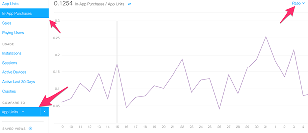 Compare two metrics and get their ratio
Now the chart displays the ratio of these two selected values. How awesome is that? You can create very powerful metrics by this, which you can track and analyze over time. Here are some examples to start with:
- Sales per downloads
- In-App Purchases per user
- Sessions per active user
- Downloads per App Store view
The other thing you could do, is not to show the ratio, but compare the two values in the dual axis view. This displays two different axis on the left and right. This can be handy, if you want to analyze the dependency of two metrics or how one value influences the other.
The last alternative is the single axis view. This means you just have one axis for both metrics, which is probably not so helpful because one of the lines might get crushed.
Break Down Metrics
You can also save your views. Plus, there are already some predefined views – e.g. the session per device by platform. With this view another thing is visible: if you want to break down your stats, you can choose an extra dimension and you get the metric broken down by platform, for example. What you find in the chart in this case, is a separate line for iPhone, iPad and iPod.
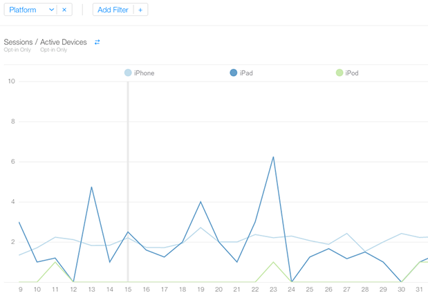 Break the metrics down by platform
The other thing you can select is a filter, which allows you to look at the data only for the newest iOS version, for example.
One last thing i want to mention, is that the usage data depends on an opt-in from the user. Probably you remember the moment, when you got asked by your iPhone, if you want to send diagnostic and usage data to Apple – that is when you opt-in or -out.
What it means for your data is that not all users are tracked but only a portion. Most of the time this won’t be a problem, because you are interested in relative information. However, you want to be cautious, if you compare usage data to store data, because the later actually includes all values, so this will distort your stats.
Conclusion of iTunes Connect Analytics
This are only some things you can achieve with iTunes Connect Analytics. I think it is great that every developer now has a decent tool included in the standard tool set. The usage is pretty straight forward for beginners, but with some experience you can compute very interesting metrics.
Let me know how your Analytics experience is and where you struggle.


